Problem: College graduates struggle to stand out after graduation.
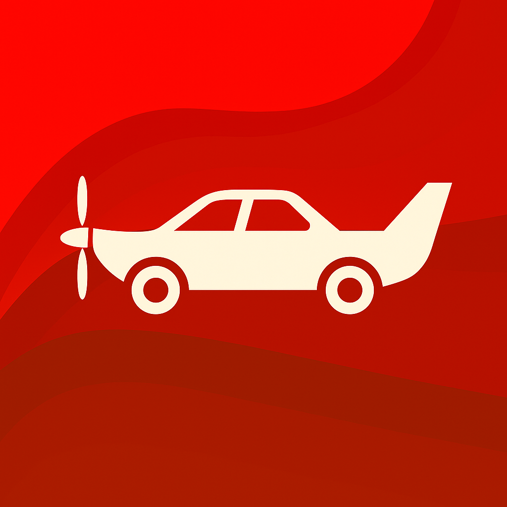
Solution: PlaneCarBoat! A site created to help designers & developers find tech events and conferences to network.
Meetups are the best place to connect and grow! If you've ever been to a good networking event, you can probably vouch.
(Events like these are exactly how I landed two internships!)
Role: Role: UX Research, UI Design, Front-End Dev
Platform: Website
Tools: Figma, Interviews, Usability Testing, HTML, CSS, JavaScript
Deliverables: Sketches, Final Designs, Front-End Code
Who are our users?
Before the interview process, I established our users into two categories. These user personas provided the team with a clear lens for decision-making, allowing us to design with precision and purpose.
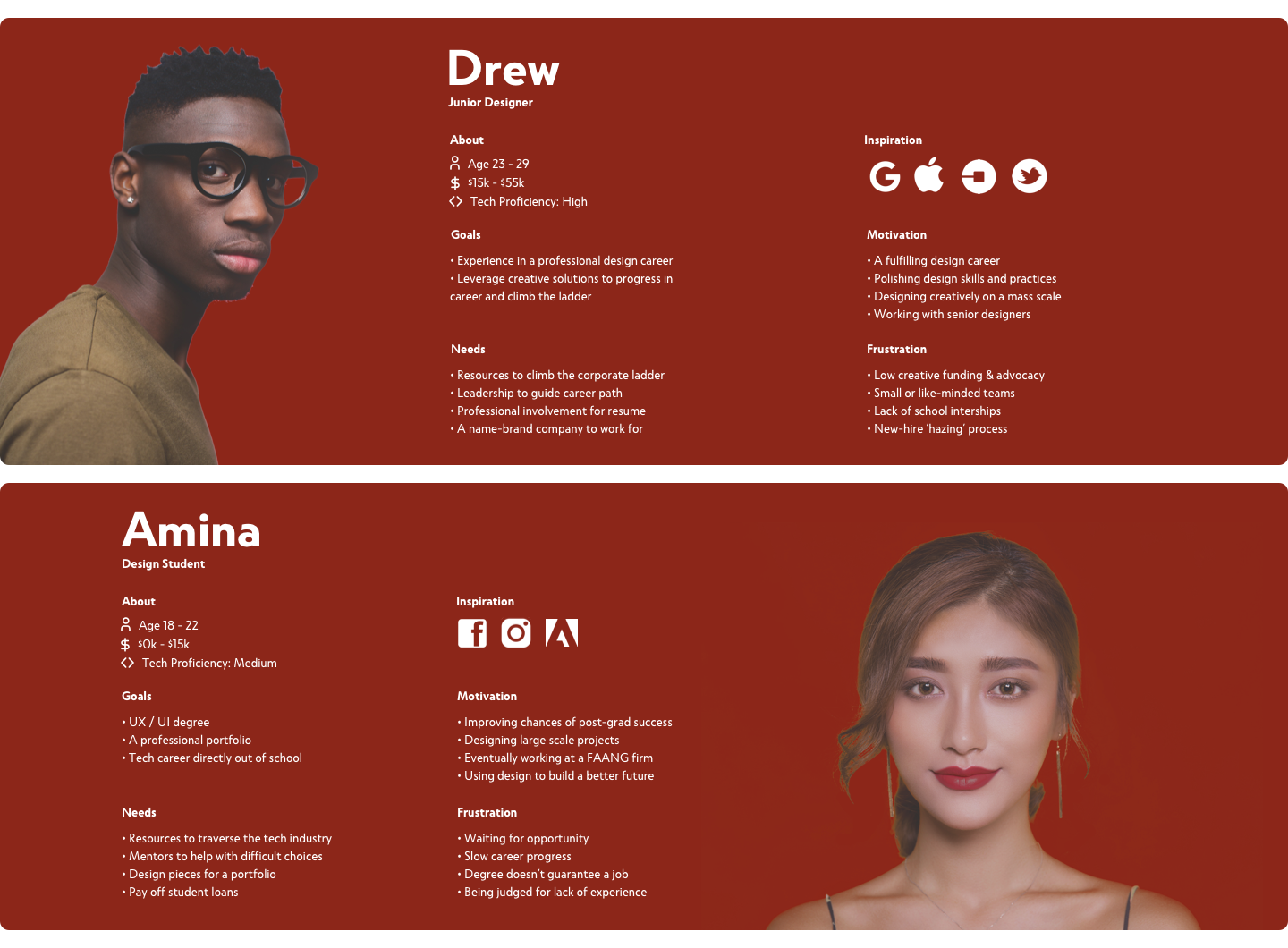
To better empathize with our defined personas, I interviewed students who reflected them, listened to their experiences, gathered feedback, and inquired about ideas they had to inform how content should be populated. Here's a noteworthy example:

One idea was to manually search the internet each week and curate events ourselves. Although simple, this process would have been time-intensive and introduced potential bias. Drawing from the quote above, I arrived at a better solution.
I introduced a “Submit Event” button, enabling users to share event ideas directly on the site. When paired with our team's curated content, this approach minimized upkeep and kept the platform dynamic. (The CTA was strategically positioned beneath the last displayed event to capture user attention).

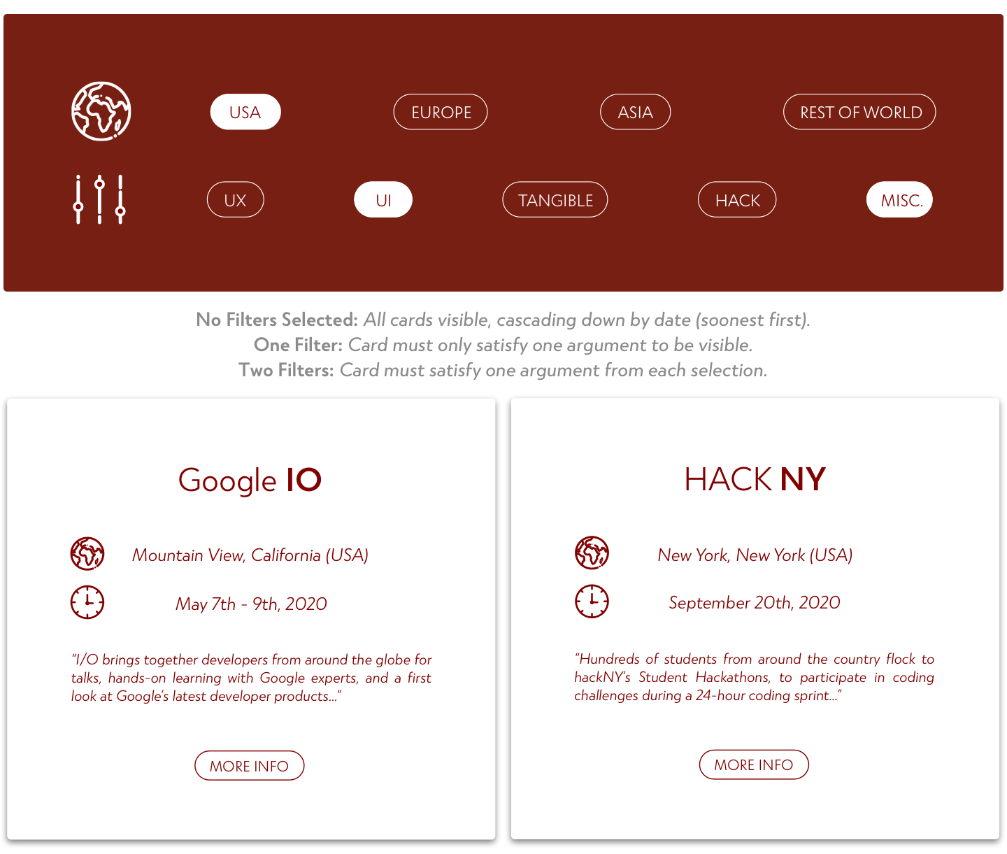
How do I filter content? I started by brainstorming a range of possibilities, then brought these to users. Through their feedback, I gained the clarity needed to design a filtering system that aligned with their expectations.
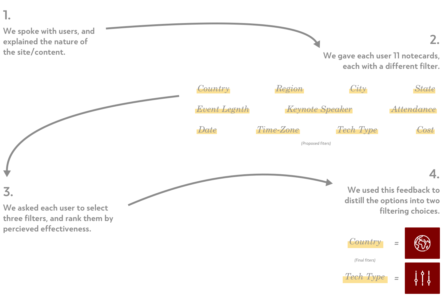
From this, I refined the filter by identifying subsets within each choice that offered flexibility without becoming overly specific.
In keeping with the site's soft curves and smooth transitions, I crafted buttons and hover states to feel playful and bouncy. These small interactions reinforced a sense of uniformity and predictability across the experience.
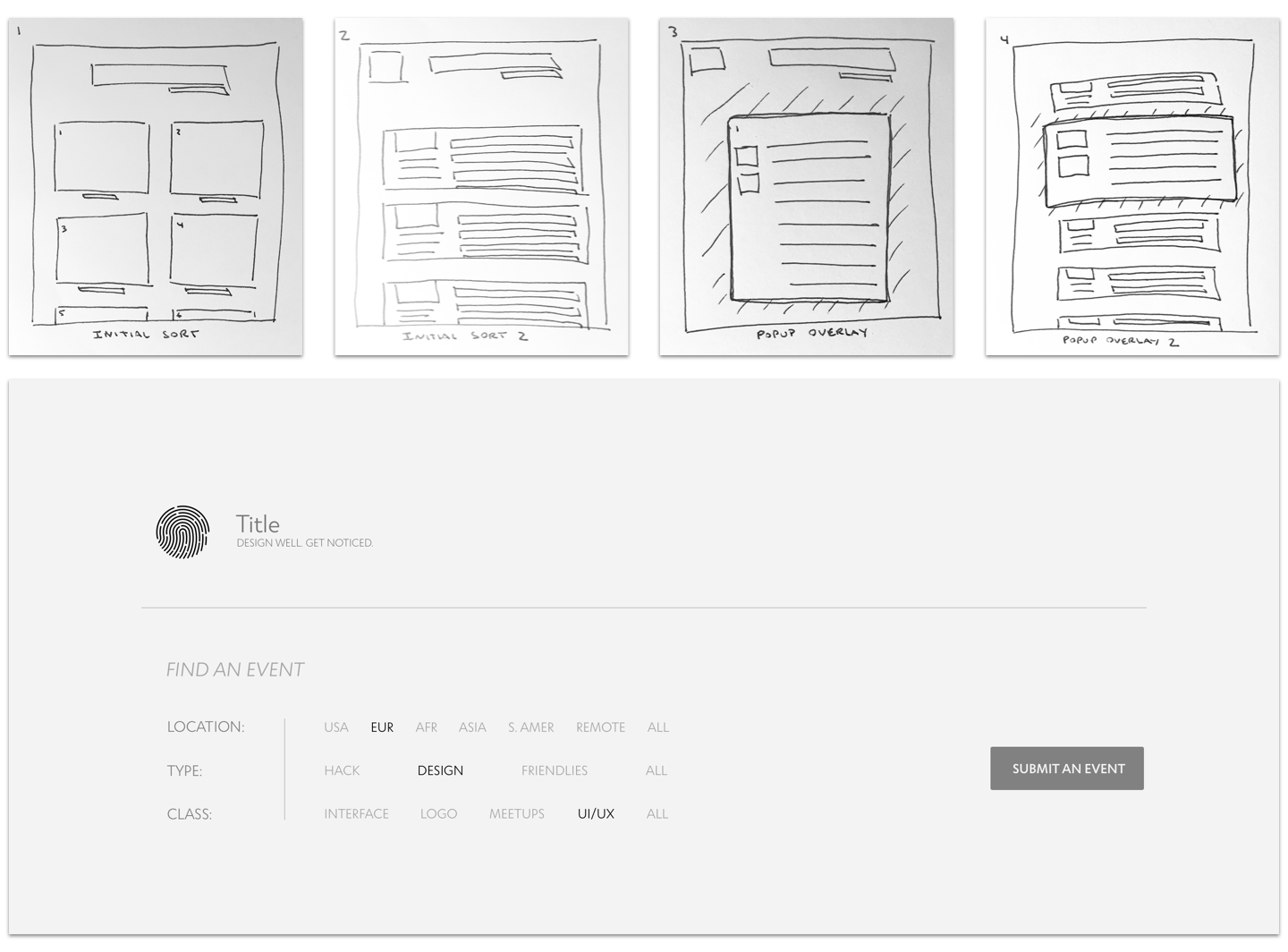
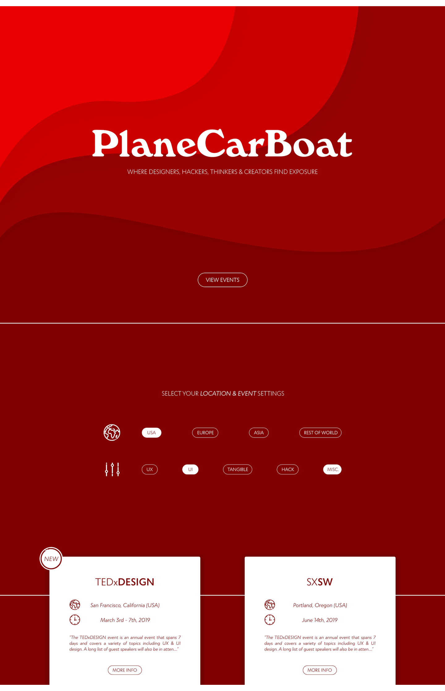
I decided that a short introductory page would best explain the site's purpose. With the right design, it could guide users seamlessly without adding friction or causing bounce.
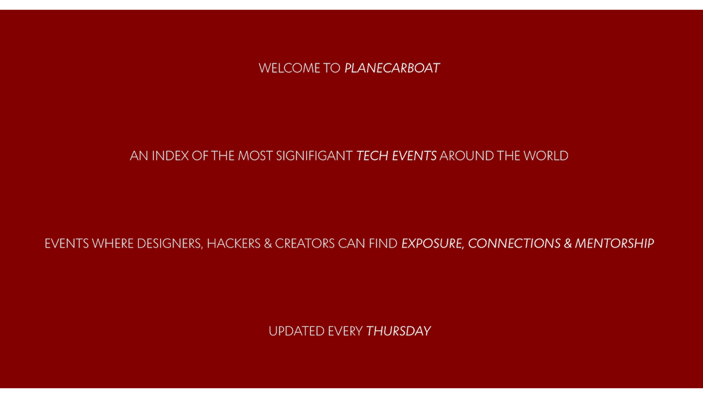
Through a series of iterations, I shaped the verbiage to balance clarity and brevity, ensuring it stayed meaningful without overwhelming users and being long-winded.
I streamlined navigation on the landing page by placing 'breadcrumbs' at the folds and enabling the 'View Events' button to auto-scroll, creating a smoother transition into the site's content.
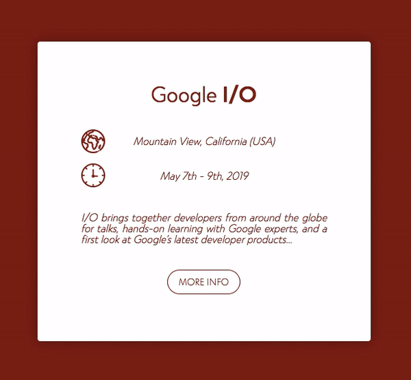
The auto-scroll interaction unveils the filtering UI while previewing the first two cards, motivating users to explore further.
(Pictured below, white lines illustrate where auto-scroll stops, and how the content would be visible, peeking from the bottom of the viewport.)
What I valued most from working on PlaneCarBoat was learning to move beyond what I thought made a product look polished or innovative, and instead focus on what made it meaningful for users. The best products aren't defined by what designers think is cool, but by how well they help people achieve their goals.
Through interviews and feedback, I learned that users wanted more than just another event site. They needed a tool that made networking feel worth their time, something reliable for creating real opportunities. That perspective shaped the features I prioritized and reminded me why listening to users is the key to building something impactful.
Special thanks to Deon White and Isaiah Morales.