
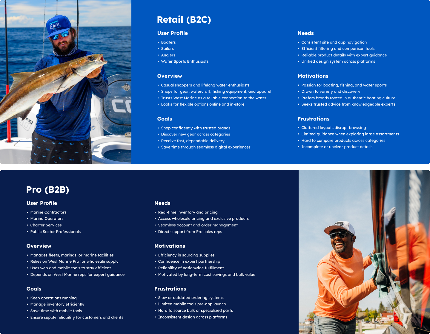
Problem: West Marine's Retail (B2C) site and Pro wholesale (B2B) platform had grown apart in design and function, leaving customers with fragmented experiences. At the same time, wholesale buyers lacked a mobile tool to manage accounts and place orders efficiently.
Solution: I delivered a full digital rebrand that unified the Retail and Pro platforms under a modern identity, while also introducing a brand-new companion app for wholesale customers. Together, these efforts created a cohesive and consistent system across web and mobile.
I worked at the intersection of design, front-end development, and e-commerce development, translating concepts into responsive, reusable components that ensured consistency across platforms. This hybrid role allowed me to contribute to both the redesign and the launch of a new app, helping West Marine reimagine its digital presence.
Role: UX Design, UI Design, Front-End Development, E-Commerce Development
Platform: Mobile App (B2B), Retail Site (B2C), Pro Site (B2B)
Tools: Figma, HTML/CSS, JavaScript, Bootstrap, Salesforce Platform
Deliverables: Wireframes, Prototypes, High-Fidelity UI, Responsive Components, Salesforce Content Assets, Page Layouts, Design Systems
Guided by West Marine's brand promise of “Your Trusted Connection on the Water”, I designed with both passion and professionalism in mind. For Retail, this meant creating digital experiences that inspire discovery and reflect the culture of boating. For Pro, it meant building tools that prioritize efficiency, accuracy, and trust, helping marine businesses run at full speed.
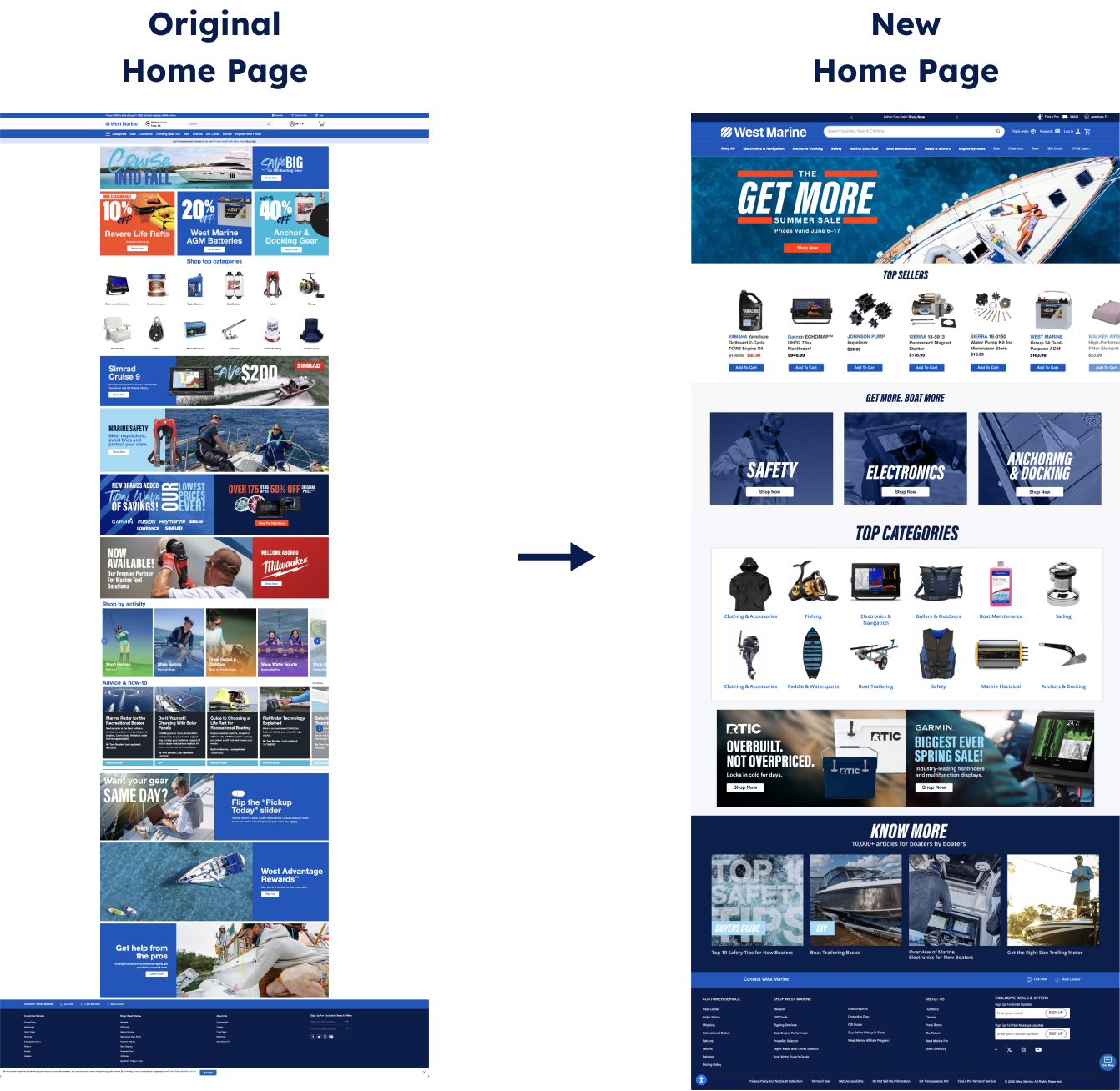
Challenge #1: The old homepage had stacked hero banners and many competing promos. Key content felt overwhelmingly cluttered for users, category entry points were buried, and the page was hard to maintain for tentpole moments.
User Insight: "I land on the homepage and there's so much stacked at the top, but I am not sure where to start. I end up just scrolling past it to get to categories."
Solution #1: I introduced a hero carousel to replace stacked banners, reducing visual noise and improving navigation. Clear rows for Top Sellers, categories, and DIY streamlined browsing. Modular layouts let marketing swap tentpole content quickly through Salesforce Commerce Cloud, enabling easier scheduling, targeting, and campaign execution.
Impact: Hero banner clicks rose 18%, homepage bounce dropped 12%, and time on page improved 9%. The modular system enabled faster campaign swaps and more consistent, polished brand experiences across promotions.
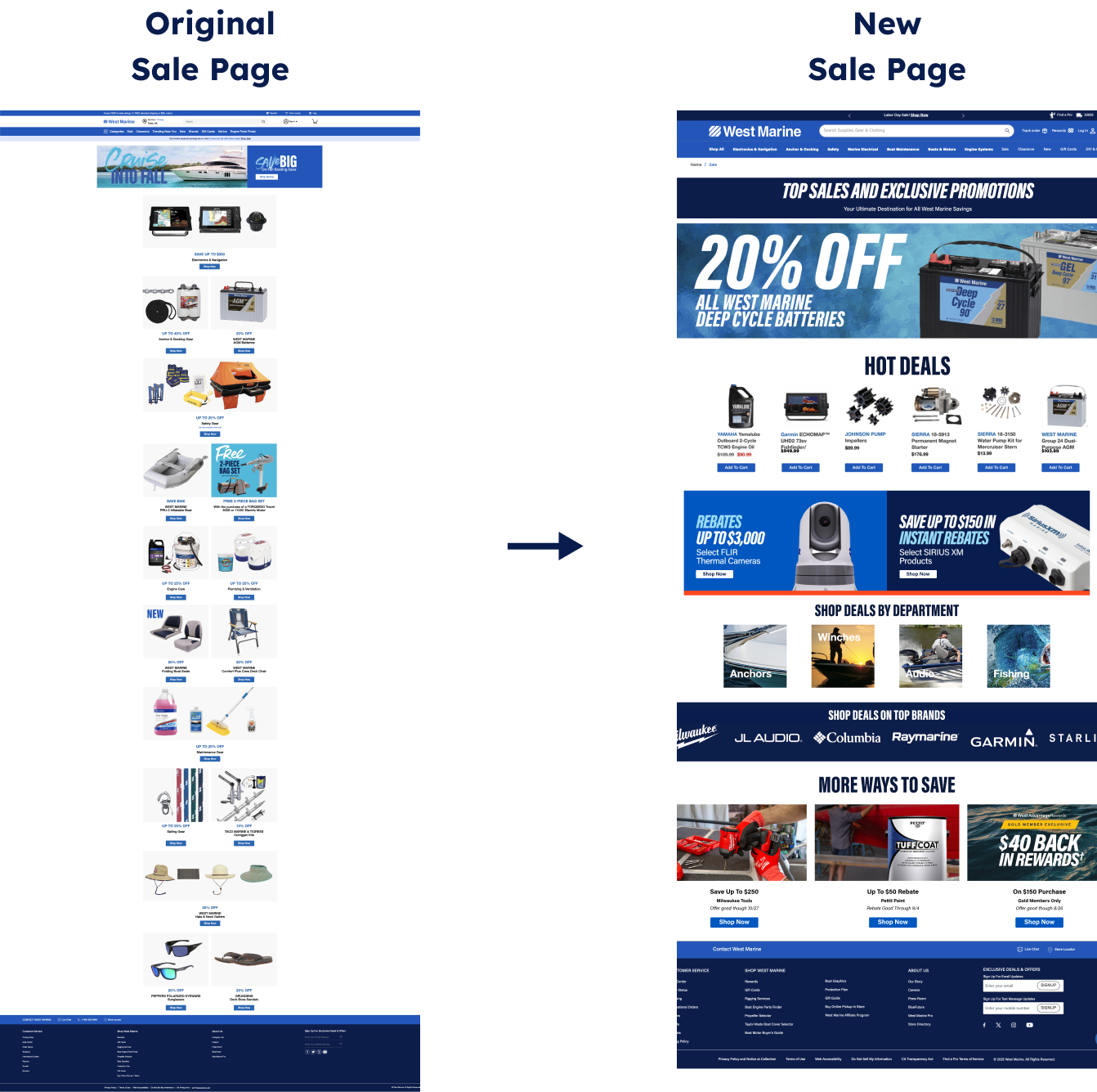
Challenge #2: Old sale pages stacked banners vertically, causing users to drop off before reaching the end of the page and miss key offers. Tentpole campaigns suffered most, lacking visibility and flexibility to stand out.
User Insight: "Half the time I don't even scroll through the whole page. If the sale I'm looking for isn't near the top, I'll probably miss it."
Solution #2: We redesigned the page with a modular system. A Hero Banner spotlighted tentpole events, ensuring major sale campaigns had the needed visibility. A Hot Deals carousel highlighted top products, freeing space for additional promotional banners, department deals, and partnered brands like Garmin, Starlink, and Milwaukee. Salesforce Commerce Cloud enabled a flexible setup for quick updates from merchandising teams.
Impact: Engagement rose 15% and add-to-cart increased 12% during sales events. Tentpole campaigns gained visibility, Hot Deals drove browsing, and marketing teams achieved faster execution with greater agility.
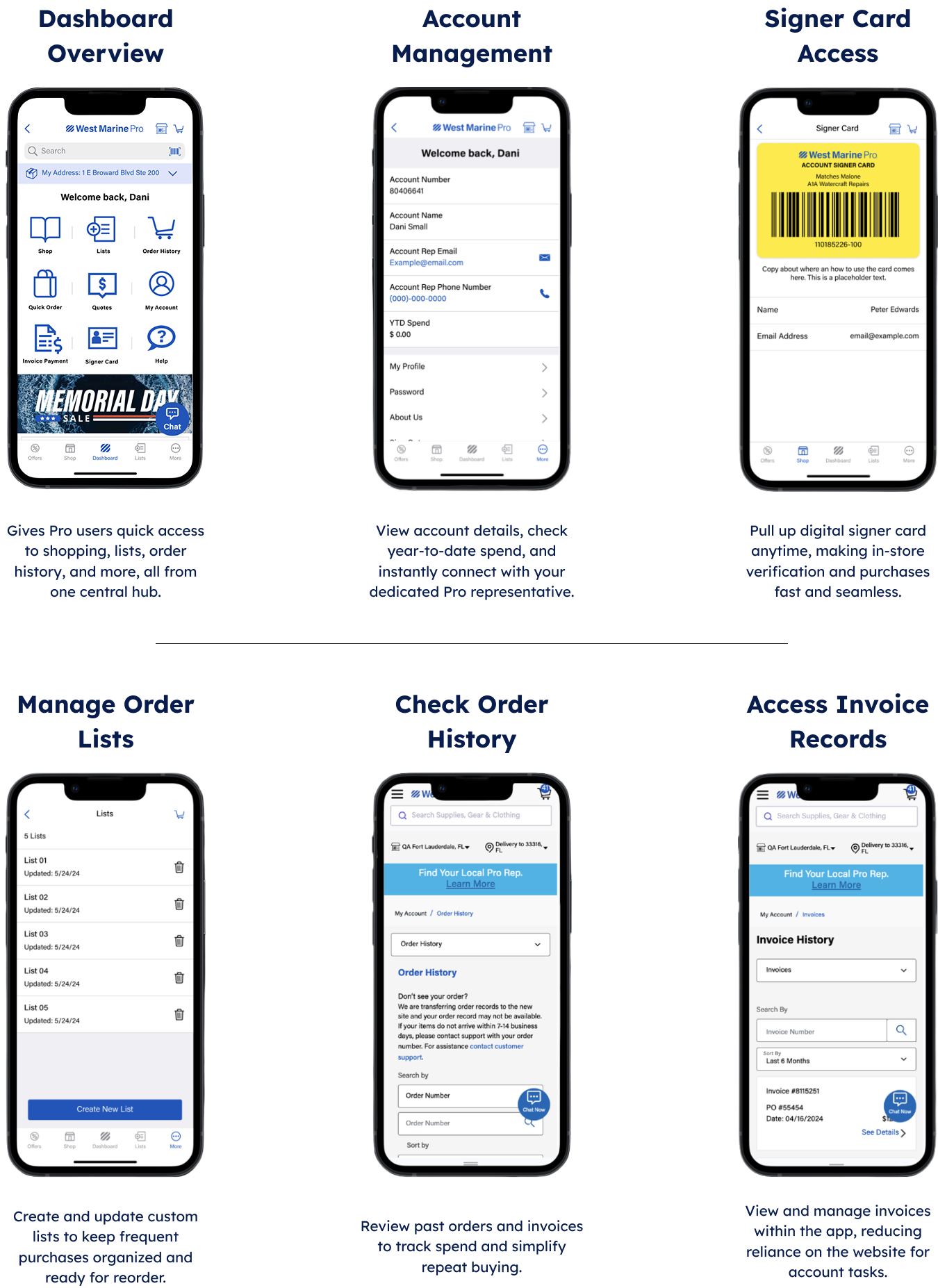
Challenge #1: Pro customers relied on the website for account management, but this created friction when they needed quick access on the go. Checking spend, signer cards, or contacting reps often required going back to a desktop workflow.
User Insight: “When I'm at the marina, I don't have time to log into the site. It feels like I'm jumping between too many pages just to check my spend, pull up a list, or find my rep's info. I just need it all in one place.”
Solution #1: We centralized account management in the app. Customers can now view details, access signer cards, manage order lists, and contact reps from one hub, streamlining fragmented workflows.
Impact: Mobile account usage grew 19%, time to access key info improved 21%, reducing friction and reflecting stronger reliance on the app in the field. Adoption of signer cards and order lists rose 16%, shifting more account activity from desktop to mobile.
Challenge #2: Pro customers lacked visibility into wholesale pricing and stock when browsing retail stores. They often visit stores to see products in person, but confirming Pro availability required contacting a representative, which slowed down the process.
User Insight: In interviews, Pro customers shared that they wanted a faster way to confirm pricing and availability without having to call their rep while standing in the aisle.
Solution #2: We built a barcode scanning feature in the app to let customers instantly view wholesale pricing and inventory in the aisle. Giving Pro members the same convenience they expect from retail browsing while keeping their purchasing aligned with wholesale benefits.
Impact: Customers gained confidence to purchase on the spot without delays. Smoother in-store workflow saved time and increased wholesale orders by 14%. Reduced friction strengthened Pro loyalty and closed the gap between retail discovery and wholesale conversion.

Designing this product taught me how design choices translate into real customer impact. It showed me that thoughtful solutions build loyalty and long-term value by addressing genuine user needs.
The most valuable lesson was learning that actively listening to customers, identifying friction points, and shaping solutions that matter reinforces why empathy and insight are essential to creating products customers trust.