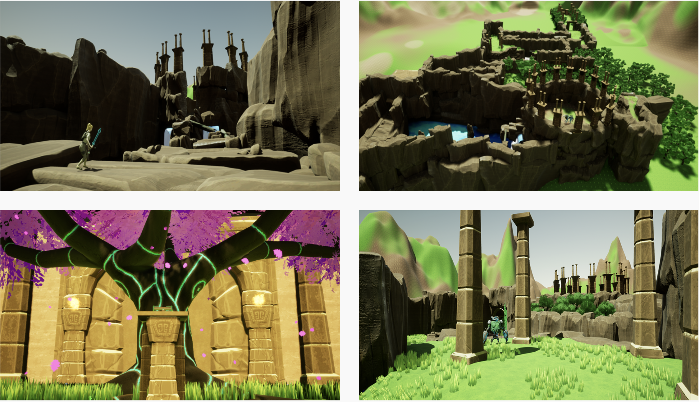


Problem: Our team skewed heavily artistic, so I had to step up and take the responsibilities of a technical lead role.
Our obstacles required a solution that fit within the technical limitations but did not compromise the essence of our artistic vision.
Solution: With my experience as designer / developer of real-time applications, I took advantage of low-poly models' dual purpose (reducing dev time while also focusing on visual elements like textures and lighting).
This in turn would allow the team to experiment with different technical mediums for an optimized solution to our hardware limitations.
Role: Technical artist, UI Design, Playtest Research
Medium: Desktop Game (Windows / macOS)
Tools: Maya, Substance Painter, Unreal Engine, Sketch, Pen & Paper, Photoshop, Playtests
Deliverables: 3D Assets, Texture Maps, Concept Art, Wireframes, High-Fidelity Mockups, Research Data
Winds of Wisteria is a third-person Action / Adventure game featuring expansive environments to explore, fast-paced combat, a variety of enemies, and puzzles to solve.
Our target demographic included young adults (ages 12 - 16) that enjoy Action / Adventure Puzzle Platformers. We used Bartle's Player Types to classify our user base's player persona types and measure our KPIs (Key Performance Indicators).
(Bartle's Player Types, also known as Bartle's Taxonomy of Players, is a character theory consisting of four archetypes. They are visualized with a quadrant model where the X axis represents users' preference to interact with other users vs. exploring the game's world, and the Y axis represents their preference to act upon vs. interact with.)

Decidedly, our focal users fall under Explorers and Achievers, so our design goal was to sell the essence of exploration and player-discovery. To do this, we designed a world that affords users substantial playtime outside the linear path, and included numerous alternative locations, each with unique themes.
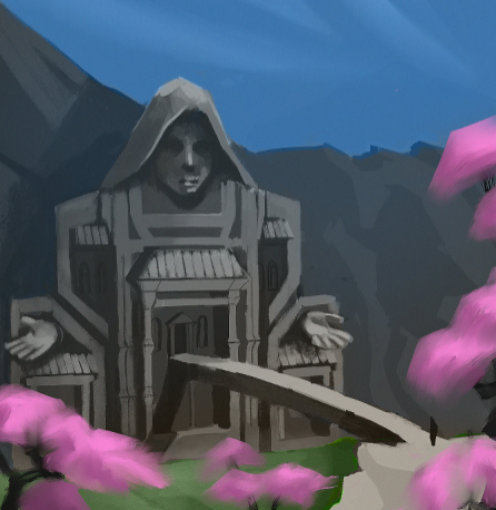
My creative process begins online, collecting various references and inspiration for the project. I take these and share them with my team / collaborators to build an artistic design system for our project - this enforces uniformity.
It is important to note that our design system is subject to change depending on design parameters. It is crucial to update it as needed, to ensure all current and new designers avoid confusion.
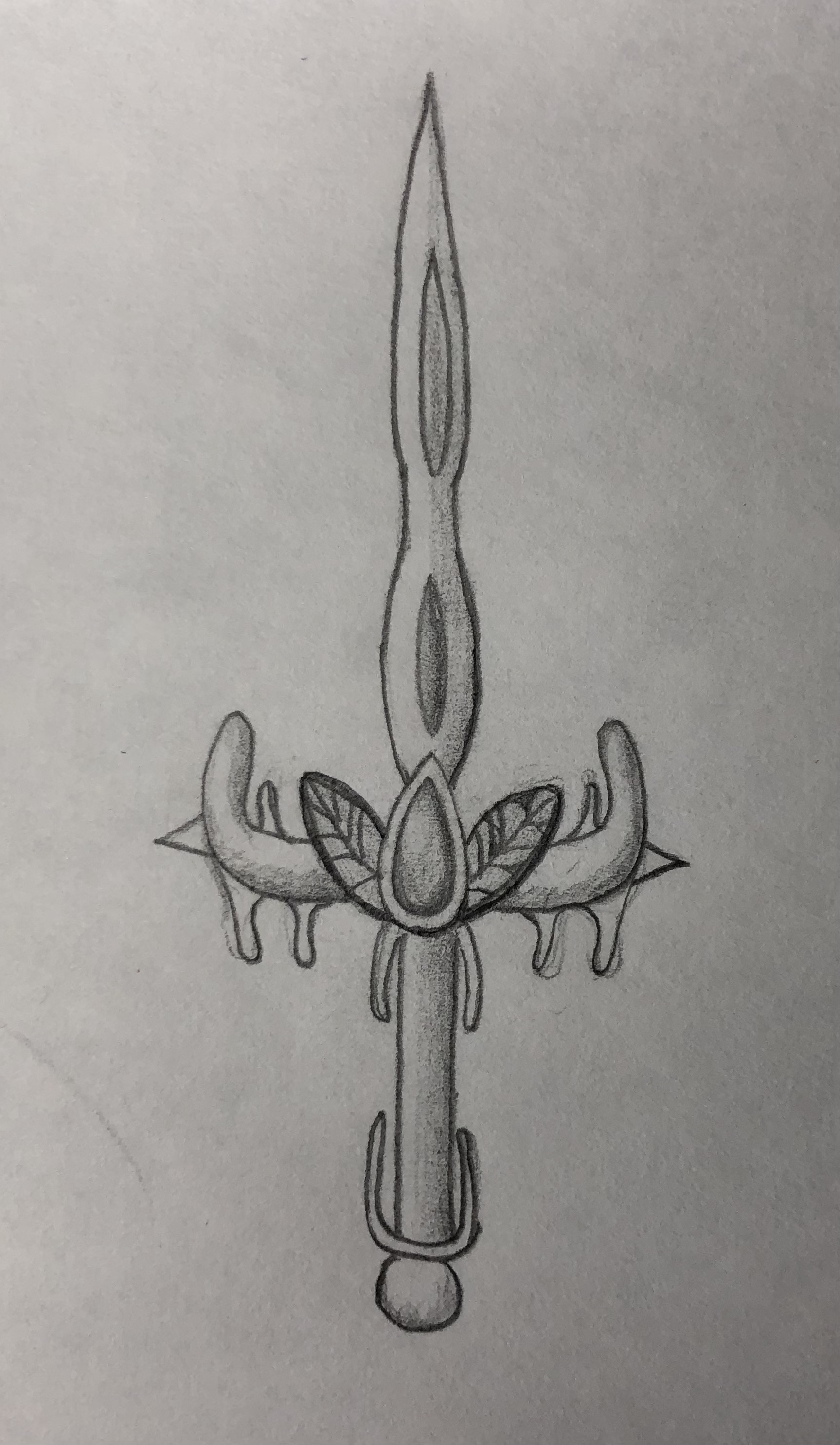
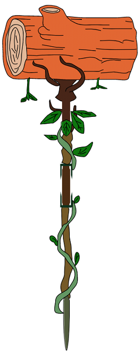
Once this is done, I begin low-fidelity concept art sketches. This promotes iteration before moving forward with the high-fidelity designs.
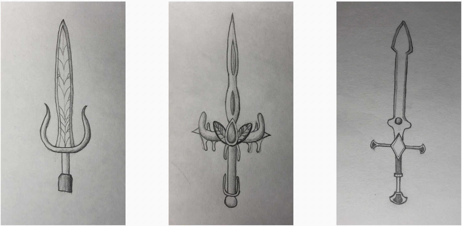
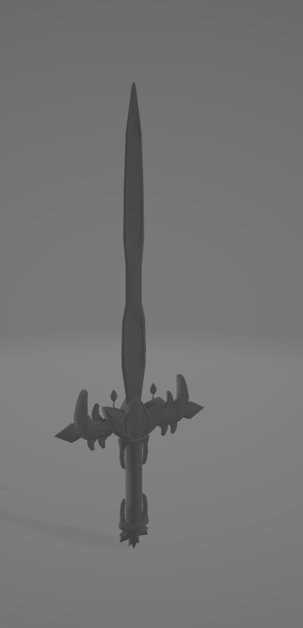
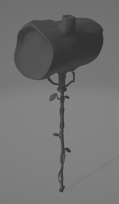
After receiving feedback and tweaking the details, I move towards 3D. Using the concept sketches, I begin modeling individual components. In order to keep processing power efficiency, I design using a reasonably low poly-count without sacrificing quality.
(Poly-count refers to the number of “triangles” being rendered on a 3D asset. An inflated poly count jeopardizes performance, resulting in software crashes, or models not rendering correctly.)
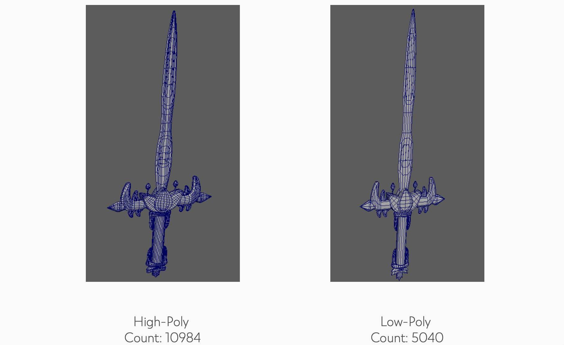
Low poly-count allows for faster rendering speed in real-time which helps maintain a high and steady frame rate (Frames Per Second a.k.a. FPS), while keeping the memory files at a low weight.
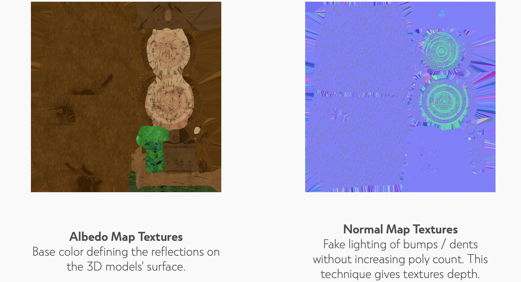
With these hardware limitations, I needed to present a creative solution to increase the quality of our low-poly designs. With my knowledge of 2D design, I used textures as an opportunity to add the details that could not otherwise be present in the modeling component.
(Texturing refers to wrapping a 2D image around a 3D object and defining how color and light will affect it.) This created a cost effective solution needed to increase the quality of our Low-Poly models' depth and lighting.
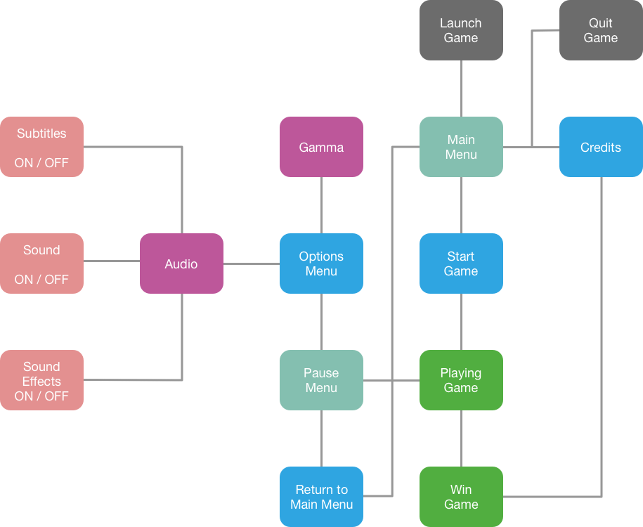
While sketching out the game's menu, I composed a structural map representing the intended UX of the menu interface. (Colors indicate similar hierarchical positions for each tab selection (Grey frames indicate intended start / end points.)
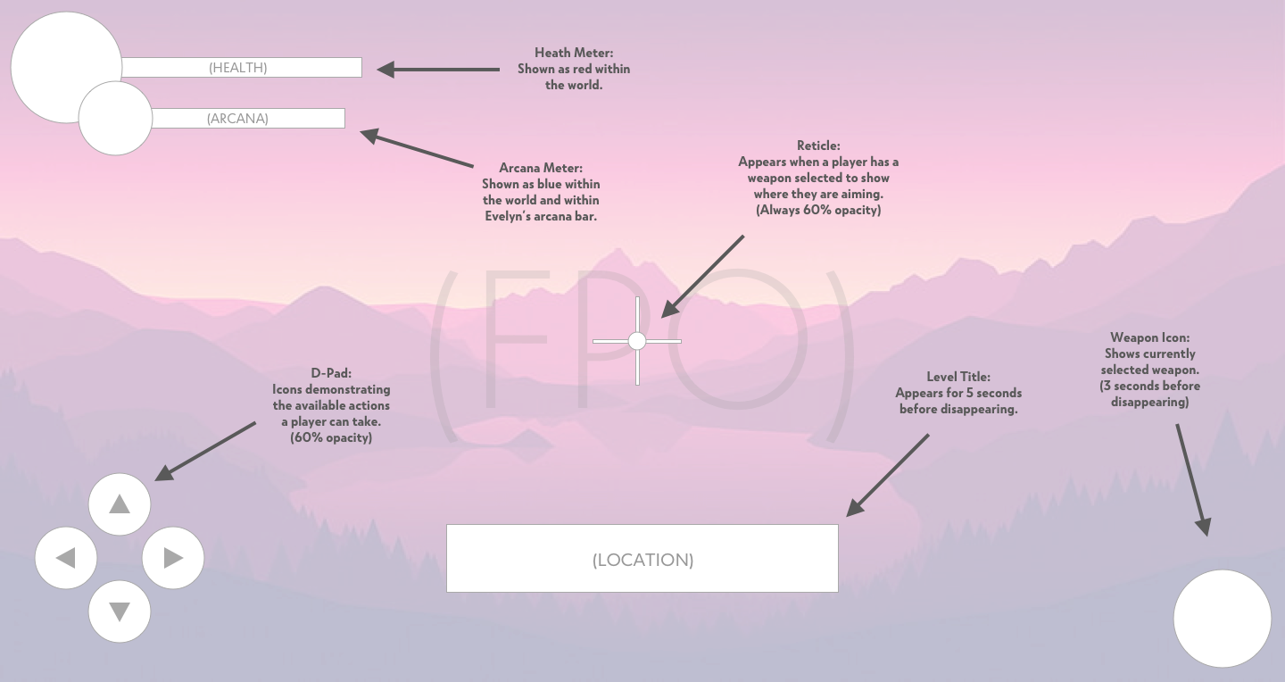
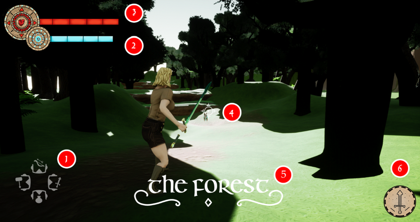
For our users' Heads Up Display (HUD) we wanted something minimal, leaving necessary space to visually interact with the game. Some time-based UI elements disappear after a few moments, leaving only the essentials to keep users fully immersed.
To confirm our artistic / technical solution improved the performance of the game, we performed a few benchmark tests. We decided to run our alpha demos on hardware with lower specifications, to make sure the game could run on more accessible computers.
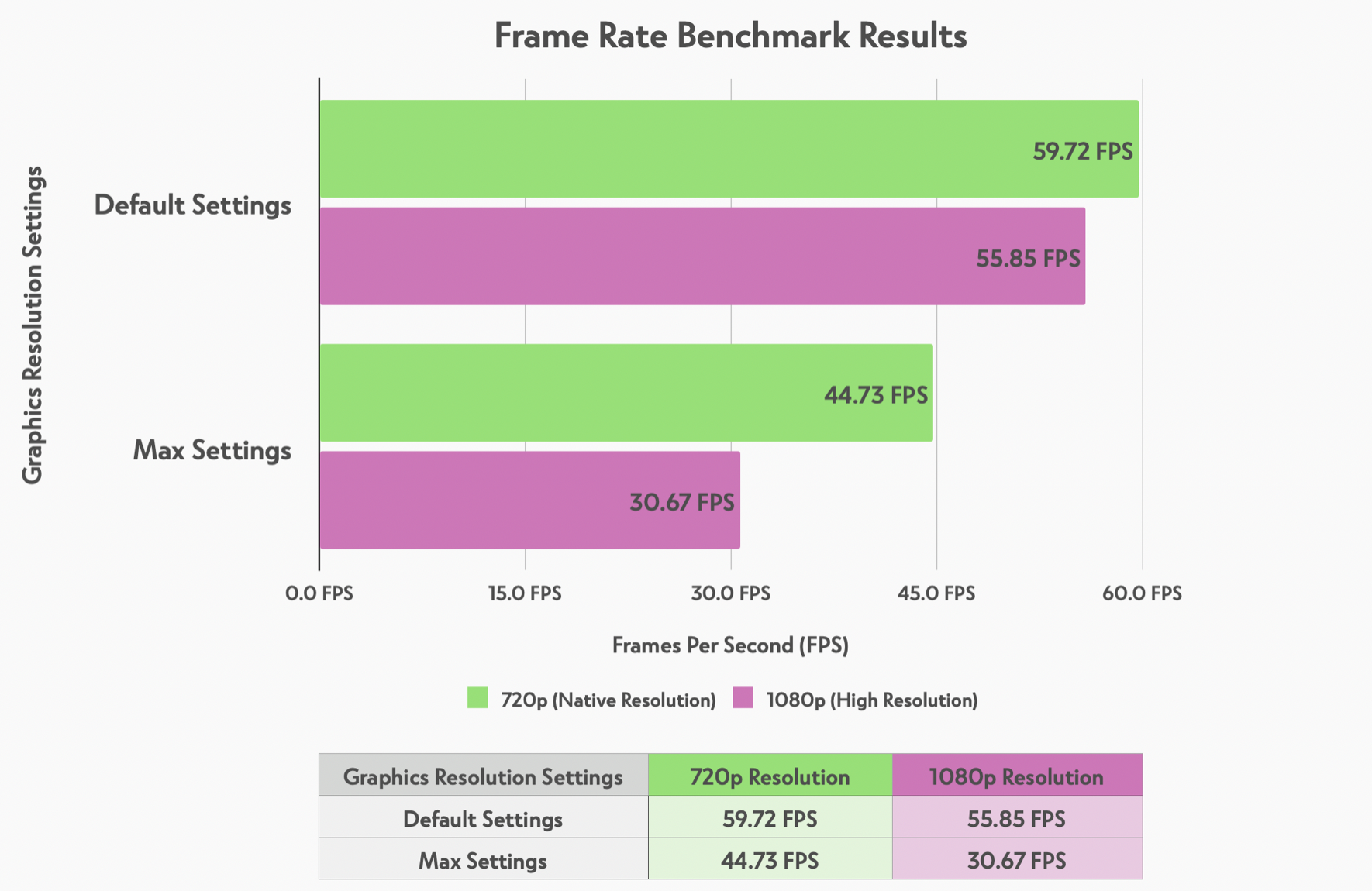
The benchmark tests were split into two portions. The first sets were playtested using default render settings and the second set to maximum. We used the screen capture application FRAPS to collect data and compare the results.
The results proved we successfully kept the FPS steady within the minimum 30 / FPS. Even on the highest settings it avoided crashing, additionally the default setting managed a frame rate upwards of 59.72 / FPS, which meant a huge success!
Our other metrics tracked the completion statistics of our user base. After the players completed our game we compared their completion status to see if the target audience had met our goals.
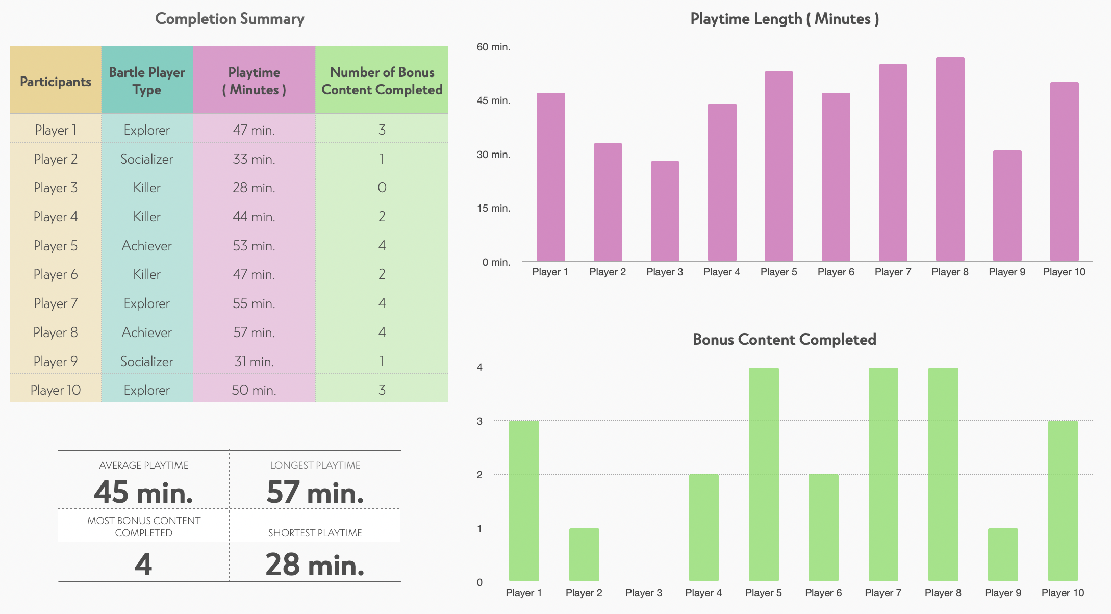
The results showed us that every user had been successful in completing the game, achieving our lofty goals. All but one user completed the desired playtime (2 minutes off) and completed at least one bonus content. Overall, we had 9 / 10 users hit our marks for the 2nd and 3rd KPI's.
An interesting fact we learned was that our game statistically fared better amongst the Achiever and Explorer Bartle Types, making us more confident that we satisfied our target demographic.
An interesting project, to say the least. Being surrounded by a team of talented artists and developers gave me a new perspective on my own workflow. There were many challenges to learn from and I feel more confident as a designer / developer for it. After 16 weeks of effort, we were able to deliver an incredible game what else could I ask for!
